Text Line Animation Color Reveal
Scroll
Text Animation
GSAP
ScrollTrigger
Split Text
JS
CSS
Preview Links
Custom JS
Enable custom code in preview or view on published site.
Enable custom code?
Last Updated: Nov 27, 2025
<style>
html:not(.wf-design-mode) .scroll-6_component {
	visibility: hidden;
}
.scroll-6_component {
	--color: #d5c3fd;
	--clip-top: 0.5em;
	--clip-bottom: 0.7em;
}
.scroll-6_component .line {
	display: inline-block !important;
	clip-path: polygon(0 calc(50% - var(--clip-top)), var(--clip-progress, 0%) calc(50% - var(--clip-top)), var(--clip-progress, 0%) calc(50% + var(--clip-bottom)), 0% calc(50% + var(--clip-bottom)));
}
.scroll-6_component .line::before {
	background-color: var(--color);
	content: "";
	display: block;
	position: absolute;
	top: 0;
	right: 0;
	width: var(--color-progress);
	height: 200%;
	transform: translateY(-25%);
	z-index: -1;
}
.scroll-6_component .line-mask {
	overflow: visible !important;
	text-align: inherit !important;
}
</style>
<noscript><style>.scroll-6_component { visibility: visible !important; }</style></noscript>
<script src="https://cdn.jsdelivr.net/npm/gsap@3.13.0/dist/gsap.min.js"></script>
<script src="https://cdn.jsdelivr.net/npm/gsap@3.13.0/dist/ScrollTrigger.min.js"></script>
<script src="https://cdn.jsdelivr.net/npm/gsap@3.13.0/dist/SplitText.min.js"></script>
<script>
document.addEventListener("DOMContentLoaded", () => {
	gsap.registerPlugin(ScrollTrigger, SplitText);
});
document.fonts.ready.then(() => {
	document.querySelectorAll(".scroll-6_component").forEach((component) => {
		if (component.hasAttribute("data-scroll-6")) return;
		component.setAttribute("data-scroll-6", "");

		SplitText.create(component, {
			type: "lines",
			autoSplit: true,
			mask: "lines",
			linesClass: "line",
			onSplit(self) {
				return gsap.timeline({
					scrollTrigger: {
						trigger: component,
						start: "top bottom",
						end: "top 80%",
						toggleActions: "none play none reset",
					},
				})
				.set(component, { visibility: "visible" })
				.fromTo(self.lines, {"--clip-progress": "0%" }, {"--clip-progress": "100%", duration: 0.8, stagger: { amount: 0.8 } })
 				.fromTo(self.lines, {"--color-progress": "100%" }, {"--color-progress": "0%", delay: 0.2, duration: 0.8, stagger: { amount: 0.8 } }, 0)
 			},
 		});
	});
});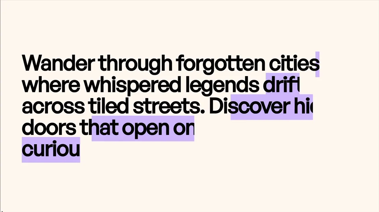
</script>- Adjust the color and how much of the text is seen (larger numbers means less of the top and bottom of the text is clipped)
.scroll-6_component {
	--color: #d5c3fd;
	--clip-top: 0.5em;
	--clip-bottom: 0.7em;
}- Adjust the color bars animation. By default, each one waits with delay: 0.2s after the text unmask starts before the color bar starts moving.
.fromTo(self.lines, {"--color-progress": "100%" }, {"--color-progress": "0%", delay: 0.2, duration: 0.8, stagger: { amount: 0.8 } }, 0)