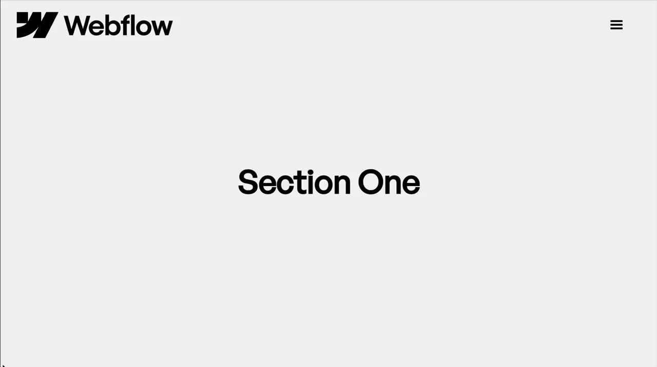
Animate Nav When Scrolled To Page Top
Nav
Scroll
Utility
GSAP
ScrollTrigger
JS
CSS
Preview Links
Custom JS
Enable custom code in preview or view on published site.
Enable custom code?
Last Updated: Nov 21, 2025
- html:not(.wf-design-mode) disables the effect inside the Designer before previewing so we don't have a transparent or large nav when scrolling through designer since JavaScript doesn't run in Designer
- .nav-2_component:not(.is-scrolled) styles the nav when it doesn't have an is-scrolled class. This allows us to apply the scroll down state styles in the style panel and adjust the page top styles from the embed.
<style>
html:not(.wf-design-mode) .nav-2_component:not(.is-scrolled) {
	background-color: transparent;
}
html:not(.wf-design-mode) .nav-2_component:not(.is-scrolled) .nav-2_logo {
	width: 12rem;
}
</style>- end: "100px top", makes the transition trigger when we scroll down the page by 100px
<script src="https://cdn.jsdelivr.net/npm/gsap@3.13.0/dist/gsap.min.js"></script>
<script src="https://cdn.jsdelivr.net/npm/gsap@3.13.0/dist/ScrollTrigger.min.js"></script>
<script>
document.addEventListener("DOMContentLoaded", () => {
	gsap.registerPlugin(ScrollTrigger);

	document.querySelectorAll(".nav-2_component").forEach((component) => {
		if (component.hasAttribute("data-nav-2")) return;
		component.setAttribute("data-nav-2", "");

		ScrollTrigger.create({
			trigger: document.body,
			start: "top top",
			end: "100px top",
			onLeave: () => component.classList.add("is-scrolled"),
			onEnterBack: () => component.classList.remove("is-scrolled")
		});
	});
});
</script>