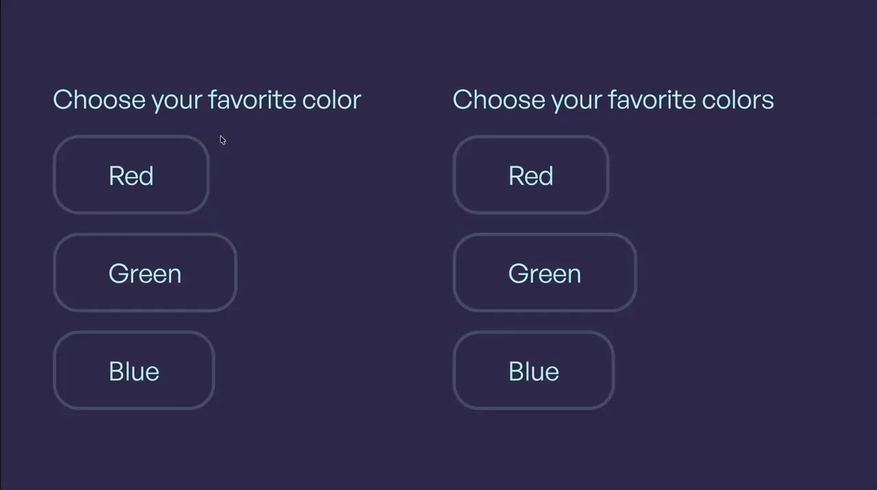
Clip-Path Inputs
Input
Form
Clip-Path
CSS
JS
Preview Links
Custom JS
Enable custom code in preview or view on published site.
Enable custom code?
Last Updated: Nov 11, 2025
- The field name and value attributes are set on the input-3_field
- The inputs are marked as required by adding a space in the required attribute's value on the input-3_field
<style>
.input-3_button.is-foreground {
	--progress: 0%;
	--left: 50%;
	--top: 50%;
	clip-path: circle(var(--progress) at var(--left) var(--top));
	transition: clip-path 600ms;
}
.input-3_label:has(input:checked) .input-3_button.is-foreground {
	--progress: 141%;
}
</style><script>
document.addEventListener("DOMContentLoaded", () => {
document.querySelectorAll(".input-3_label").forEach(component => {
if (component.hasAttribute("data-input-3")) return;
component.setAttribute("data-input-3", "");
const target = component.querySelector(".input-3_button.is-foreground");
function updatePosition(x, y) {
const rect = component.getBoundingClientRect();
const leftPercent = ((x - rect.left) / rect.width) * 100;
const topPercent = ((y - rect.top) / rect.height) * 100;
target?.style.setProperty("--left", `${leftPercent}%`);
target?.style.setProperty("--top", `${topPercent}%`);
}
component.addEventListener("mousedown", e => updatePosition(e.clientX, e.clientY));
component.addEventListener("touchstart", e => {
const touch = e.touches[0];
if (touch) updatePosition(touch.clientX, touch.clientY);
}, { passive: true });
});
});
</script>